Sightlines, Not Sitemaps: Design Your Website Like a Room People Want to Walk Through

Photo: Dietmar Rabich, CC BY-SA 4.0, via Wikimedia Commons
Most studio websites are built like filing cabinets. Here is the work. Here is the about page. Here is the contact form. Here is the logo. Everything is technically present. Nothing is staged. The visitor arrives, scans, and leaves without ever feeling like they walked into a room.
That is a design problem, not a content problem. And production designers have been solving it for decades.
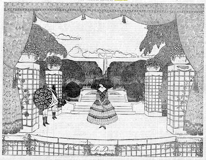
A set does not explain itself. It arranges itself. It uses sightlines, negative space, focal points, texture, and light to tell you where to look and how to feel. A website can do the same thing. In fact, it should. Your site is the first set most clients will ever walk through. If it feels like a brochure, they will treat it like one.
The Front Door Is Doing More Work Than You Think
When you walk onto a well-designed set, you do not need a title card to tell you what kind of world you are in. The palette, the proportions, the objects, the light—they all do the work before anyone speaks.
Your homepage is that first step through the door. It should establish mood before it lists services. That does not mean a giant video of a camera rig. It means a clear visual point of view. A color story. A sense of scale. A focal point that says look here first. The visitor should know what kind of studio you are before they read a single sentence.
Most sites fail here because they try to say everything at once. Logo, tagline, services, awards, client list, reel, blog, newsletter. It is the equivalent of a set with every wall painted a different color. The eye has nowhere to rest, so it leaves.
Negative Space Is Traffic Control
Production designers use empty space on purpose. A bare wall can make a chair feel important. A wide floor can make a doorway feel like an event. Emptiness is not wasted space. It is pacing.
Websites need the same discipline. White space is not a failure to fill the page. It is how you make the important thing feel important. A tight grid of twelve project thumbnails is not more impressive than three images with room to breathe. It is just louder. Loud is not the same as strong.
If every part of your site is competing for attention, the visitor will give attention to none of it. Pick the focal point. Let the rest support it.
Texture Beats Polish
A set with no texture feels like a showroom. A website with no texture feels like a template. That does not mean you need a distressed background image or a handwritten font. It means the details should feel chosen, not default.
Production designers think about material: wood grain, metal scuff, fabric weight, the way paint catches light. Web teams can think about material too. Type weight. Image grain. Motion timing. Borders that feel like a decision instead of a default. The small physical cues that tell a visitor this was made by people with a point of view.
The goal is not decoration. The goal is credibility. A client who feels craft in the interface will assume craft in the work.
Sightlines Are Just User Flow With Better Shoes
On a set, sightlines are about what the audience sees and when. On a website, they are about what the visitor notices and in what order. That is hierarchy. That is choreography. That is design.
Ask the same questions a production designer asks. What do I want them to see first? What should they see next? What can wait? What is the equivalent of a dark corner that nobody needs to explore? What is the hero prop?
Most studio sites have a hero prop problem. They have too many. The reel, the case studies, the team, the manifesto, the awards. Everything is a hero. Which means nothing is. Pick the one thing this page is about and design the room around it.
Light Is Still the Whole Game
Production designers talk about light because light creates focus. On a website, contrast does the same job. Contrast in value. Contrast in scale. Contrast in density. A dark section next to a light section. A large image next to small type. A quiet page next to a loud one.
If everything has the same contrast, the visitor has no way to navigate emotionally. They can navigate functionally, but not emotionally. And emotional navigation is what makes someone remember your studio after they close the tab.
Design the Room, Not the Brochure
None of this means your site needs to be complicated. A single room can be powerful. A single page can be a set. The point is to stop thinking of your website as a container for information and start thinking of it as an environment for a decision.
The client is walking through. They are looking for a reason to trust you. They are reading the room before they read the copy. Give them sightlines. Give them negative space. Give them a focal point. Give them texture. Give them a reason to stay in the room.
That is not web design. That is production design with a different budget line.